What I did with the time AI gave back
This month Apple released a rebuilt version of Sola, the travel app I am building for women who travel solo, and most of my hours on it went into things I had never studied, like typefaces, icons and what the app should say to a woman when she signs up. AI made the building fast enough that I could afford to learn them properly while I built, and I think that trade is where better products are going to come from.
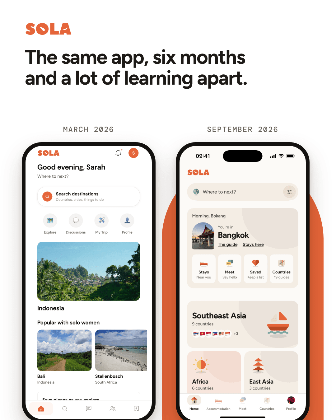
On 11 September Apple released version 1.1 of Sola, a travel app for women who travel solo, which I have been building for a little over a year. On the surface it is a new look, a warmer colour, new icons, a different typeface, and the screens are laid out differently. Underneath, it is the first version where I think you can see that I understood what I was building, and the interesting part is where that understanding came from, because it did not come from writing code faster, even though I did write code faster.
There is a loud argument right now about whether we have reached AGI, artificial general intelligence, the point where a machine can do any thinking a person can. I don't think we have, and nothing in my own work makes me think we are close. What I have noticed is smaller and closer to home, and I found myself saying something I never expected to say, which is that maybe I should slow down a little. I mean that about my own days, not about the labs.
The skill moved into the steering
When I started, most of my time went on getting the app to work at all. A small bug could take an afternoon of going round in circles, and a change I wanted on a Monday might still not be right by Friday. That has almost completely changed. I can describe what I want in plain language and the tools understand what I mean far more often than they don't, so fixes and changes that used to take days now take minutes.
What surprised me is where the skill went. I have spent more than a decade in digital, running paid media, building online sales channels, watching what people actually click on and what they scroll straight past, and that turns out to be exactly what I lean on now. The tools will build almost anything I describe, which means the whole job has become describing the right thing and noticing when what came back works but is still wrong.
Here is a small example of what that looks like. In early September I had a draft of a new home screen for Sola that was, by any technical measure, finished. It had a large hero image, a feed of inspiring places, a little card about what women had noticed, all of it smooth and well built. I threw it away, because it was a marketing page, and the thing a woman opens Sola for is information: where to stay, how a city works, what other women found. I wrote it down for myself in one line, that our product is an information product, and the home screen that shipped is dense and plain and gets her where she needs to go. No tool made that call. A decade of watching people ignore beautiful marketing pages made it.
The hours went back to first principles
The time that frees up has gone somewhere I didn't plan for. I spend far more of it on the question underneath the product, which is what a woman landing alone in a city she has never seen actually wants from an app in that moment, before I decide anything about what to build.
Some of the answers have been uncomfortable, because they undid things I had already built. Sola was going to charge a monthly subscription, and I dropped it. Most people travel a couple of times a year, so asking them to pay every month for something they use a few weeks a year was never going to make sense, however good the app was. What does happen often is the decision itself: on one trip a woman makes something like a dozen small choices about where to sleep, which area to base herself in, how to get in from the airport. That is where Sola has to be useful, and it is why the finder for places to stay became the centre of the app and several features I was proud of became secondary.
Others were about values rather than business. Sola never tells a woman where not to go, and there are no star ratings or scores anywhere in it. A lot of travel content for women reduces the whole subject to avoidance, a list of places and hours to stay away from, and I think that gets it backwards. Women should be able to travel anywhere, and the job of the app is to hand her what other women found and let her decide. That principle now shapes decisions as small as a single word on a screen.
Learning a trade I never had
The part I have enjoyed most is learning things that were never my trade. I have no background in branding, type or illustration, and a year ago I would have treated them as decoration to sort out later, or to hire out once there was money. What changed is that the barrier to building has dropped so far that I can learn them properly while the app is still being built, without having to choose between the two.
Type was the first lesson. Earlier in the year Sola used a soft, characterful serif for its headlines, and on its own it looked lovely. In the app it made everything feel gentler and more generic than the product is, and I later learned it had become one of the most overused faces in AI-generated design, which is exactly the look I did not want. It went, and so did its replacement, and the typeface Sola uses now is plainer and more confident. Each swap taught me a little more about why a font carries a feeling before anyone reads a word.
Icons were the second. Last week I looked at the menu at the bottom of the app and felt that it didn't belong to the rest of Sola, as if two different apps had been stitched together. The icons across the app are small drawings, a bed, a map, two speech bubbles, and the menu was using thin line icons drawn in a completely different style. A year ago I would not have had the words for why that felt wrong, let alone the time to fix it. Now the menu uses the same drawn family as everything above it.
Words were the third, and the one I got wrong most often. The sign-up flow asks a woman to confirm she is over eighteen and identifies as a woman, because the parts of the app where women meet each other depend on it. My first version of that screen said, more or less, that those parts were for adults. It was accurate and it read like a notice on a gate. I rewrote it until it sounded like a well-travelled older sister explaining something from her side, so that the reason is about the women she will meet knowing who she is, rather than about a rule we are enforcing. It is one screen and a few lines, and it is the difference between an app that trusts her and one that manages her.
The complication
It would be too neat to leave it there. The same speed that lets me try a new typeface in an afternoon also lets me ship a mistake in an afternoon, and a lot of the time AI saves me goes straight back into checking: running every change against the real data in the live app, reading screens the way a stranger would, and not believing a green test that says everything is fine. I also know that a trained designer would have reached most of these conclusions faster than I did, and that the design went through seven rounds of changes this year partly because I was learning on the job, in public, on a live product.
I still think the trade is worth it, and not only for me. For most of the history of software, understanding what people fundamentally want and knowing how to build it lived in different people and different budgets, and a small founder usually had to pick one. That is less true every month. The building is getting cheap enough that you can spend what it used to cost on the slower questions, and on the small choices that tell a person you understood them.
The test I keep coming back to is simple. A woman lands somewhere she has never been, on her own, and opens Sola in the queue for a taxi. Before she reads anything properly, the colour, the icons, the typeface and the first sentence either tell her this was made by someone who understood where she is standing, or they don't. I would not have known how to pass that test a year ago, and I am not sure I pass it yet, but I have finally had the time to learn what it asks.
Get the next essay in your inbox.
Notes and guides on ads, measurement and building with AI. One email a week. No noise.
Read next
I got bored and rebuilt Tony Hawk's Pro Skater
Claude Opus 5 came out this month, I had an evening free, and the game I wanted to play was one I last played on a PlayStation 1 in the early 2000s. So I described it in one prompt and asked for the whole thing in a single file. The first version ran. What follows is the prompt, what it got right, what it got badly wrong, and why the second part matters more than the first.
EssayThe human touch is becoming a paid tier
Klarna replaced the work of 700 support agents with AI, watched quality fall, and its chief executive now calls human customer service a VIP product, like hand-stitched clothing. Across travel, banking and consumer apps the same repricing is underway, with chatbots for the mass market and people for the paying few. While the argument about AI rages on, the market has quietly made human attention a premium tier, and the thing worth defending is ordinary access to both the tool and the person.
EssayYour next customer may never see your website
Google searches grew right through 2025, but by early 2026 fewer than a third sent a click to the open web, and AI answers now read websites and speak for them. A dispatch from running search campaigns for small businesses in South Africa and the Philippines: how AI answers pick their sources, what is worth changing on a page, and why local search still decides most sales.